By now you will have seen the extraordinary front page of The Sun. This image appeared as a twitpic reply within an hour or so. We’ve posted it a little after midnight and it is currently getting more than 1000 views a minute. It is not beyond the bounds of imagination that it could get more views than the Sun’s front page by close of voting. Click the image to register your view.
Cameron, Thatcher and Jonathan Freedland in The Guardian
Jonathan Freedland wrote a fascinating piece in the Guardian today that compared the place we find ourselves today with the early days of the Thatcherite years. The quote from Neil Kinnock was four years into the reign of the Iron Lady but his points were well made.
Popular Hashtags in the 2010 UK General Election Campaign #GE2010
This general election has been the first in which Hastags have played a part, they are used in social networks and most commonly in twitter, as user-generated meta data. Put simply they are a way of identifying and therefore following tweets that cover the election or an aspect of it . Here is a quick guide to some of the most popular ones
#GE2010 – This is the default tag for posts that relate to the 2010 general election. There are others but this has emerged as the most popular because it is economical in its use of characters.
#GE10 – A shorter form, but less used than the above. Useful if you have run out of characters but likely to be seen by fewer people.
#Vote – Has been used both as a short generic hashtag for the election but was also popular in encouraging voters to register before the deadline.
#UKElection – More instantly recognisable than #GE2010 but not quite as popular because it eats up more characters.
#LeadersDebate – One of the most interesting because it was part of a phenomenon that TV programme makers call “two-screen”, using a laptop or smart phone to comment on live television. It mean that social networks rather than conventional media were the first to pass judgement on the performance of the part leaders during the TV debates.
#iagreewithnick – Echoing Gordon Brown’s famous utterance during the first TV debate and used primarily to show support for the LibDem leader during the bounce his party received after the first debate.
#NickCleggsFault – Widely employed to mock the print media’s ‘assassination’ attempts on Clegg. It was a meme that lasted a few days as Clegg was accused of all manner of spoofed wrongdoings.
#paxo – Similar to the #LeadersDebate but employed for the Paxman leader interviews.
#LibDemFlashMob – The hashtag used to organise the Liberal Democrat gatherings in Trafalgar Square and other UK cities on Bank Holiday Monday.
#InVinceCable – Used by a group of digital marketeers and PR people, and their fellow travellers, to promote Vince Cable as Chancellor in the event of a hung or balanced parliament. (FD Election10 endorses the objectives of the #InVinceCable campaign).
#Labourdoorstep – Used by Labour candidates and activists to emphasise the fact that they were taking the campaign directly to the voters.
I’m going to venture another one that might become popular in the next few days. #Hung10 anyone?
Guitar Duo Mandelson and Brown Jammin’ for Victory
The social web has thrown up some bizarre things but this has to be one of the weirdest, and yet somehow compelling bits of content that has surfaced during the election campaign. It’s not that clear to me whether it is pro or anti Labour. Either way it’s essential viewing.
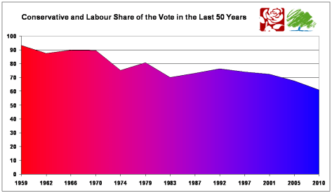
Labour and Conservative Decline Traces Back Over Half a Century
 This morning I posted about the decline in the overall share of the two “major” parties and how this pointed to a certain hung parliament.
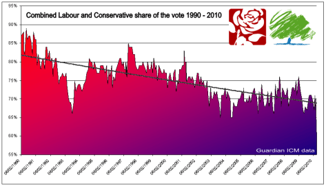
The post attracted a lot of traffic and several comments not least from one Ben Goldacre, journalist, doctor and author of the Bad Science blog. I used ICM/Guardian data and plotted a graph showing the decline in votes over the last 20 years for the two major parties. He accused me of bullshitting and repeatedly called me a twat because I had omitted data from 1984-1990 that was available from the Guardian. In fact the reason for starting from 1990 was because 20 years seemed like a good length of time to support the argument and there was a blip in the early eighties caused by the split of the SDP from Labour and their alliance with the Liberals. I ought to point out that I wasn’t entirely blameless in the exchange in that I suggested he’d had a drink or two. Sorry Ben.
I am now posting using election data from the last 50 years and the latest poll data for 2010. I think the picture is pretty clear and undistorted and supports the earlier hypothesis. The combined support for the two main parties has been falling for 50 years. If that continues and there is no proof that it will then two-party politics is on the way out. The defining moment might just be on Thursday.
‘Hung’ Parliament Guaranteed by Labour and Conservative Decline
 The TV debates aren’t responsible for the Hung Parliament that will follow Thursday’s election as surely as night follows day. A quarter of a century of decline in the combined Labour and Conservative share of the vote means that the two party stranglehold over UK politics is on its way out and Clegg’s TV performance was just a tipping point.
One of the wonderful things about the web is the accessibility of data. The Guardian has published all of the Guardian/ICM polling data since 1984. At Election 10 we took the combined Labour and Conservative share for every poll and created the graph above. In 1990 the two parties were claiming almost 90% of the vote between them this has shrunk to a little over 60% and it has been a steady consistent decline. A continuation of this would mean a government taking power that was opposed by around 65% of the population. Even our bizarre electoral system can’t sustain this.
To predict the future we must delve into the past. In this case the past is telling us that the party is very nearly over for the reds and blues and the voters will be calling time this Thursday.
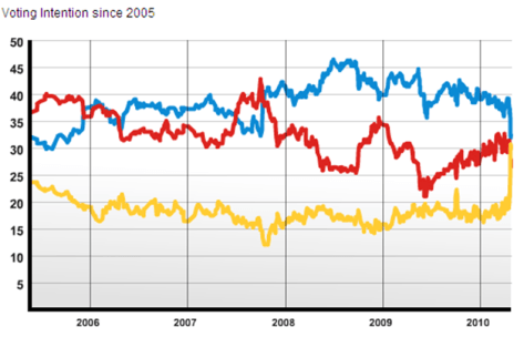
How the 2010 Election Gap has Narrowed in Red, Blue and Gold
There’s a brilliant web site, independently run by YouGov political analyst Anthony Wells, called the UK Polling Report. Along with lots of other election data is brings together all the opinion polls every day. It also has data going back to the last election. There is perhaps no better representation of what has happened in the last couple of weeks than this graph taken from the site. Between 2005 and 2008 the Labour and Conservative shares were much of a muchness, whilst the last two years saw unbroken Tory dominance, albeit with a steady narrowing of the gap since last summer. Then wham bam thank you mam the three parties collided after the first TV debate and that look very much like where we’ll be in just over a week’s time.
Is Tory Spin Doctor Henry Macrory Telling the Whole Story?

Henry Macrory the Head of Press at the Conservative Party posted a tweet today with a link to the picture (above) of Jack Straw talking to an empty square in Wolverhampton this week. He had uploaded the picture himself and it appears today on the Conservative Home blog stating – No one is listening to Labour, John Prescott couldn’t attract a crowd last week and Jack Straw has the same problem this week. But the scene below was caught on video by the local Express and Star newspaper and shows Straw wrapping up his soapbox address to a fair size crowd.
Was YouGov’s Flawed Leaders’ Debate Poll Deliberate or Merely Inept?

Since we posted on the Leaders’ Debate Poll conducted by YouGov on Thursday there has been an extraordinary revelation. YouGov says their internet poll on the TV debate was conducted between 9.27pm and 9.31pm, so the majority of responses were taken during the debate not after it.
This is critical because it means the poll was taken during the summing up speeches. The speeches took place at the following times:
Brown 9:26:30 – 9:28:05
Cameron 9:28:08 – 9:29:17
Clegg 9:29:18 – 9:30:47
That means that over half of the polling would have been done before Clegg summed up in the debate. It also meant that up to half the responses were taken whilst Cameron was summing up and had sole command of the floor and the cameras. That’s a serious flaw in the process and is either incompetence or intentional distortion. You decide which you think it was.
Did Leaders Debate Damage YouGov Brand Value?

The YouGov/Sun poll gained an enormous amount of exposure on Sky TV last night when it appeared minutes after the TV debate wrapped up. It put Cameron clearly in the lead and fired up an already excitable Kay Burley. When other polls appeared the tale was somewhat different as ITV/ComRes, the Guardian/ICM and The Mirror all put Clegg first, with The Mirror even reporting that Cameron had come last. So what was going on. A quick look at twitter confirmed a broader sense of astonishment at the YouGov findings. The tweet…
YouGov Poll: Earth round 23% Earth flat 64% Earth other-shaped 13% #LeadersDebate
..was posted by hundreds of voters. A Twitpic that has been viewed over 18,000 times suggests that YouGov has been polling on behalf of either the Tories or Labour to elicit voter fears in the event of the Liberals gaining a big share of the vote.
Twitter posts also pointed to the extraordinary fact that the founder and (until the start of the campaign) CEO of YouGov is a Conservative candidate. It isn’t much of stretch to question the independence and therefore reliability of a polling organisation that may be commercially and politically aligned to one of the major parties. In this game value and reliability are very closely linked.


