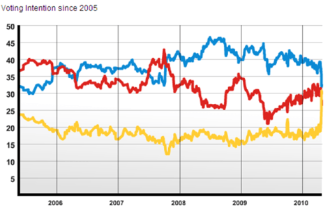
There’s a brilliant web site, independently run by YouGov political analyst Anthony Wells, called the UK Polling Report. Along with lots of other election data is brings together all the opinion polls every day. It also has data going back to the last election. There is perhaps no better representation of what has happened in the last couple of weeks than this graph taken from the site. Between 2005 and 2008 the Labour and Conservative shares were much of a muchness, whilst the last two years saw unbroken Tory dominance, albeit with a steady narrowing of the gap since last summer. Then wham bam thank you mam the three parties collided after the first TV debate and that look very much like where we’ll be in just over a week’s time.

